It gets more and more difficult to create original logos. No matter how clever your idea, the chances are someone has come up with something very similar. Why is that?
Well, we’re all surrounded by the same influences and exposed to the same shapes, forms, and patterns. With the importance of branding in the marketplace, and thousands of designers working on similar projects, it’s obvious that ideas will, from time-to-time, look almost identical.
Here I have compiled a few similar logos, showing them side-by-side so you can see what graphic designers face today.
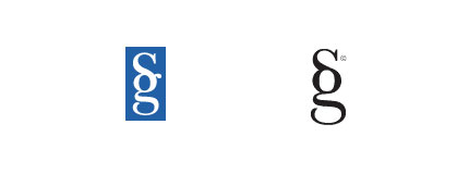
Sumpter & Gonzalez LLP and Stylegala
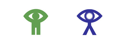
National Film Board (recently updated) and Virtual Global Taskforce
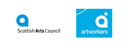
Scottish Arts Council and Artworkers
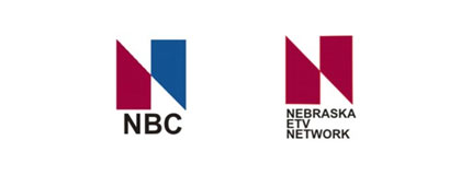
NBC and Nebraska ETV Network
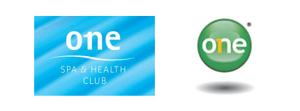
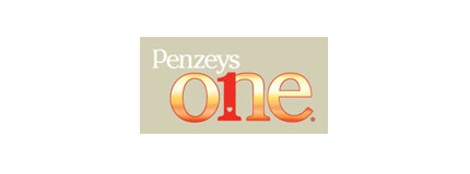
One Spa, Manulife One and Penzeys One Magazine
SimpleBits and LogoMaid (LogoMaid link directs to a Flickr thread with a fascinating commentary)

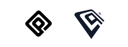
pseudoroom design and Cyberathlete Professional League

Graphic Design Blog and Peter GI


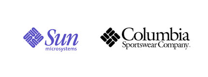
Sun Microsystems and Columbia Sportswear
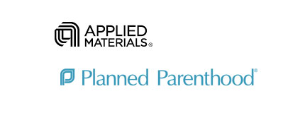
Applied Materials and Planned Parenthood
searchmash and smashLAB

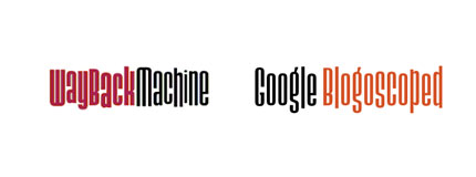
Wayback Machine and Google Blogoscoped
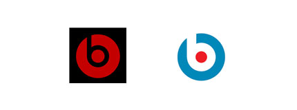
Beats by Dr. Dre and Anton Stankowski‘s 1971 Stadt Bruhl logo
Not to mention the BigFix and Priority Parking logos
British Paints and Pagan Osbourne
LA Lakers and LA Clippers
Belfast City and South Hams Food and Drink
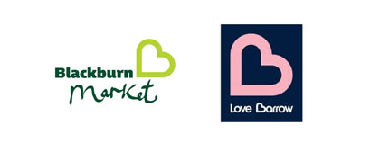
Blackburn Market and Barrow.

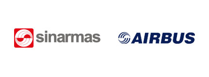
Sinar Mas and Airbus
Wise words
“Tell yourself at every step in the design process that someone has undoubtedly already thought of this and what can you do to really set it apart. In design, and particularly logo design, the pessimistic axiom that “everything has already been done” is becoming more and more true, and it is only the virtuous designer who can continue to stand out in a sea of sameness.”
— MIKE DAVIDSON
__Suorce: logodesignlove