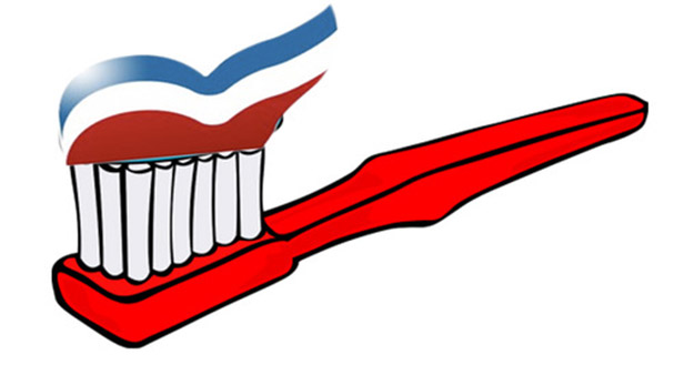
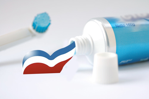
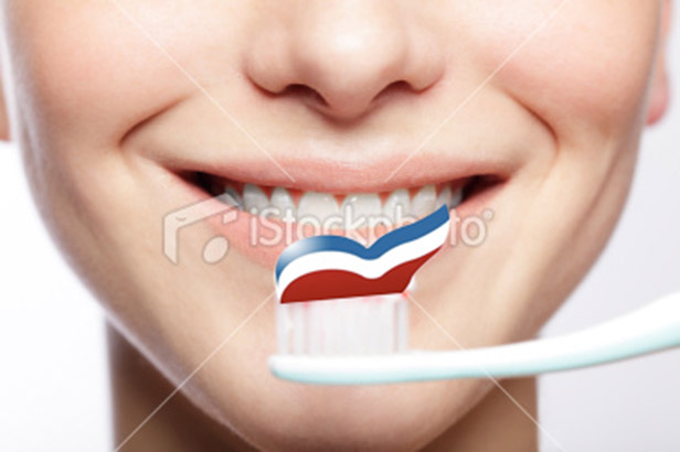
Apparently someone was staring at the Mitt Romney campaign logo for too long this morning while waiting for the presidential candidate to announce his VP pick on the deck of the USS Wisconsin.
> Related: Free download Romney’s Logo vector in .AI format
![Romney’s Logo Looks Like Toothpaste Romney’s Logo Looks Like Toothpaste [PICS]](https://logoeps.com/wp-content/uploads/AutoGen/8ffb45484ad6aa6cecf0c8074343c196.jpg)
That’s the inspiration behind a Tumblr whose first entries began this morning during Romney’s VP speech. It’s quickly turned into a meme on the “Romney’s Logo” Twitter account, whose profile reads, “I may look like toothpaste, but I bleed red, white and blue. In a tube.”
There’s one designer who’s allegedly not impressed with the logo. Alice Twemlow, chair of the MFA Design Criticism Department at the School of Visual Arts, was quoted on the “Romney’s Logo Is Toothpaste” Tumblr, “This logo is like a fake Louis Vuitton handbag.”
[PICS] Romney’s Logo vs Toothpaste


What do you think of Romney’s logo?
Suorce: Mashable


